Welcome to Hawk Happenings Data Exploration!
Visualizations
Featured Post
October 13: Nestlings snack all day on the prey delivered in the morning or afternoon
Previous posts
October 2: When were (or weren’t) we watching?
September 20: From Observations to Visualizations
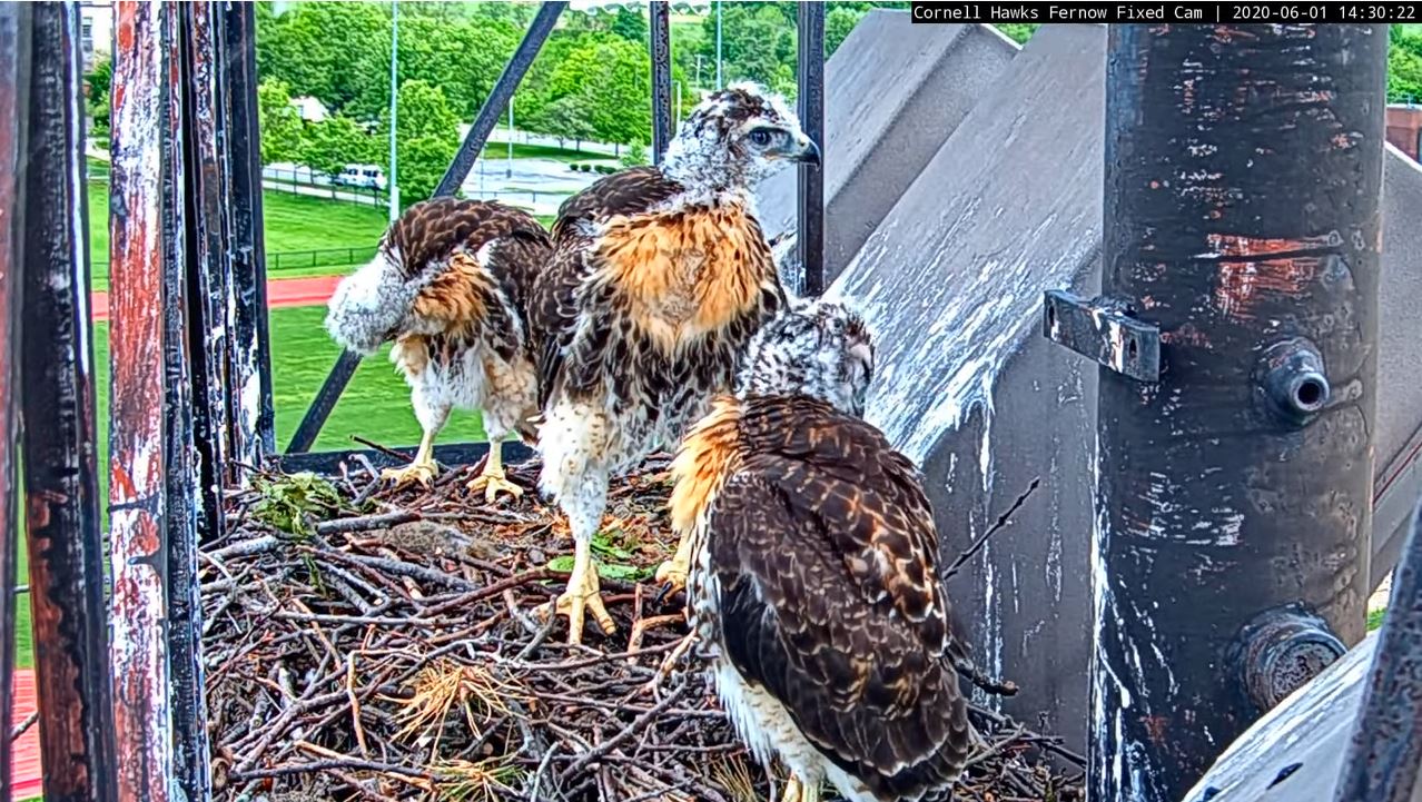
Join us to explore visualizations of the data collected by the Hawk Happenings community from May to June 2020. More than 320 people made over 12,500 observations while watching the Cornell Lab’s Red-tailed Hawk cam. We’ve put together a series of interactive graphs so that we can answer the question we set out to investigate:
What is the frequency of certain hawk behaviors, and does this frequency vary with the weather?
Now it’s your turn to use these interactive visualizations to explore the data. When looking at the visualizations, keep our research question in mind while also noticing if you have other questions that pop up along the way. Share your observations, questions, and ideas in the comment forums below each visualization. At the end of this exploration we’ll draw from your comments in the forums, as well as in an upcoming live Q&A session, to surface the most interesting and important findings. Then, we will publish what we find in a public post!
To get started, check out the newest blog post for a guided discussion about a featured graph.
Want to know how we turned all of the community observations into these visual explorations?
Check out this blog post to learn more.
Want to know more about the Red-tailed Hawk nest featured in the project?