What does the weather data look like?
September 18, 2020Weather is important to understand when studying birds because it can potentially affect how they behave. The Hawk Happenings community recognized this and specifically included weather in their research question, theorizing that Red-tailed Hawk behaviors at the nest might vary with changes in the weather.
After data collection ended in June, we reached out to the closest weather station, located at the Cornell Apple Orchards . The weather station recorded the hourly average temperature, but there were gaps in the data due to technological malfunctions. To supplement that dataset, we also obtained data from the next nearest weather station at the Ithaca Airport, where temperature was recorded right before the top of every hour.
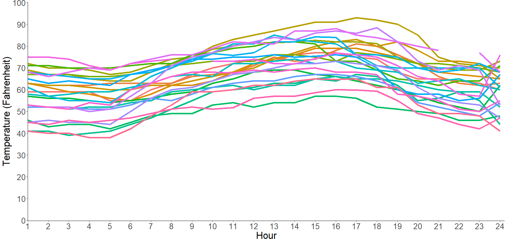
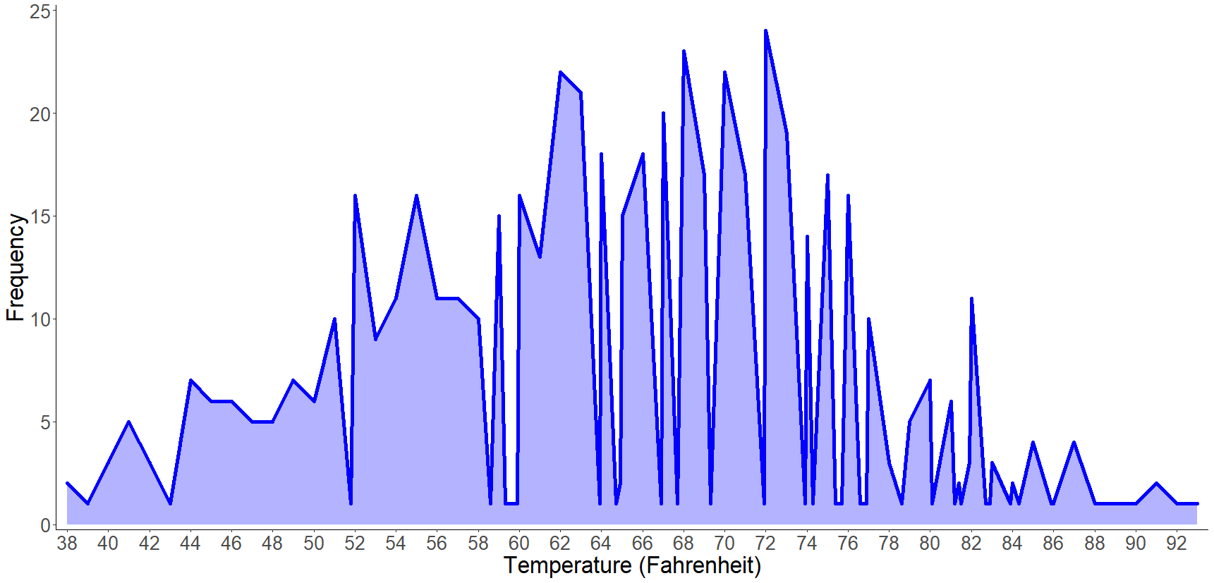
We’ve created interactive visualizations that link the behavioral data to the weather data (for example how vocalizations relate to temperature), but wanted to also provide visualizations of the weather data itself. Looking at how much the temperature varies by hour, by day, and understanding the frequency of certain temperatures will help us better understand what’s going on and to inform our interpretations.
Hourly temperature
Daily temperature

Temperature frequency
What are your thoughts after looking at these visualizations? Do you have any ideas or questions about how we are looking at weather? Should we consider another variable or is temperature a good one to use?
Please share your thoughts in the forum below!