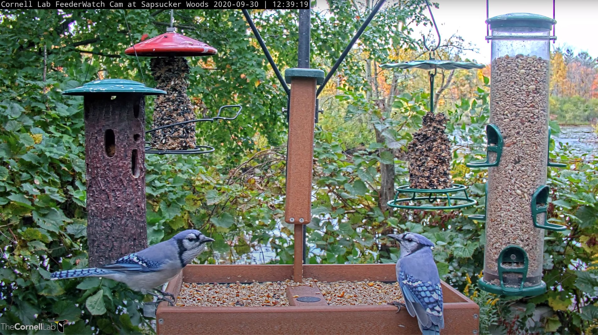
Welcome to Cornell Feeders Live Data Exploration!
Join us to explore visualizations of the data collected by the Cornell Feeders Live community watching the Cornell FeederWatch cam. In just two weeks, more than 490 people made over 120,000 observations! We seek to answer the following community-chosen questions:
- What is the daily visitation pattern of different species at the feeders?
- How does weather affect the probability of different species visiting the feeders?
Visualizing the data is the first step in understanding what the data looks like and what it can tell us about the birds visiting the Cornell FeederWatch cam. When looking at the visualizations, we invite you to share the patterns you see and questions you have in the forums below each visualization. At the end of this exploration we’ll draw from your comments in the forums, as well as in an upcoming live Q&A session, to surface the most interesting and important findings. Then, we will publish what we find in a public post.
Ready to get started?
- Check out the first set of interactive visualizations
- Learn about how we worked with the data in the From Observations to Visualizations post
- Learn more about the feeding station featured on the Cornell FeederWatch cam in the About The Feeder post

