We were almost always watching!
June 1, 2021For two weeks, the Bird Cams Lab and Bird Cams community came together to tag data in real time from the Cornell FeederWatch cam. At the end of data collection, the community amassed over 120,000 observations of the eight study species visiting the feeding station: American Goldfinch, Black-capped Chickadee, Blue Jay, Red-bellied Woodpecker, Red-winged Blackbird, Tufted Titmouse, and White-breasted Nuthatch.
As in any scientific investigation, in order to look at the biological data (birds visiting the feeding station) we need to also look at the sampling effort. In this investigation, sampling effort reflects the amount of time spent watching the cam and collecting data. We visualized this in two ways. First as the number of people watching and collecting data each hour (Figure 1). Second, the amount of time at least one person was watching and collecting data each hour and day.
Figure 1. The number of people watching the Cornell FeederWatch cam and collecting data each hour from 5:00 AM through 8:00 PM for the first five days of data collection.
Below is the first visualization in a set of “Time Watched” visualizations, displaying the number of hours watched by at least one person during each day of the data collection period. For each day during data collection, there was at least one person watching and collecting data for the majority of daylight hours, including the time just before sunrise and after sunset. Even though the number of people peaked midday, there was still a small number of people watching at the tail ends of each day.
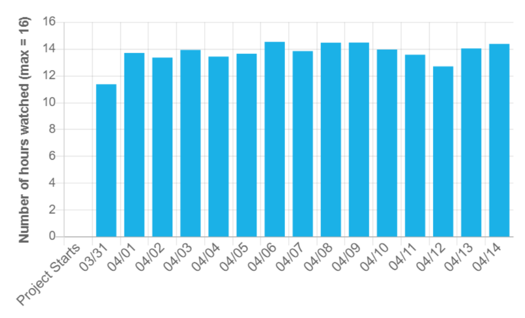 Figure 2. The number of hours at least one person was watching the Cornell FeederWatch cam and collecting data each day during data collection. The maximum number of hours that can be watched in any day is 16 (from 5:00 AM through 8:00 PM).
Visualizing the variation in sampling effort is crucial in understanding what the data can tell us about the species visiting the feeding station. For example, we can look at a visualization of the percentage chance that species will visit the feeding station during a half-hour interval each day during data collection. If there is a lower percentage chance of a species arriving during a half-hour interval on March 31 compared to April 6, that may be because there really was a lower percentage chance or it could be because we watched the cam less (i.e. less sampling effort).
We invite you to explore the first round of interactive visualizations that show how much time was watched and how the percentage chance of each species visiting the nest varied by day and by half-hour intervals. See what patterns you can find in the data and be a part of this next phase in the Cornell Feeders Live investigation: data exploration. Your input is valuable in understanding what the data mean and how we can begin to answer our research question.
Please share your questions and thoughts below or in the forums below each visualization.