Cornell Feeders Live: From Observations to Visualizations
May 26, 2021The Cornell Lab of Ornithology’s FeederWatch cam gives us a window into the lives of birds seen at backyard feeders in the Northeast United States. While many of the species are considered common and well-researched, we can still make discoveries in the context of their behavior at a bird feeder.
Back in February, the Bird Cams Lab community watched the cam together and worked with Bird Cams Lab scientists to co-create a scientific investigation so that we could learn more about the birds that visit the feeding station. After weeks of discussion and voting, they decided to pursue two questions: (1) What is the daily visitation pattern of different species at the feeders? (2) How does weather affect the probability of different species visiting the feeders?
We collected data in real time on the cam and this presented two interesting challenges for understanding and analyzing the data: (1) multiple people watching at overlapping or different times, and (2) multiple people logging the same event.
Data Collection
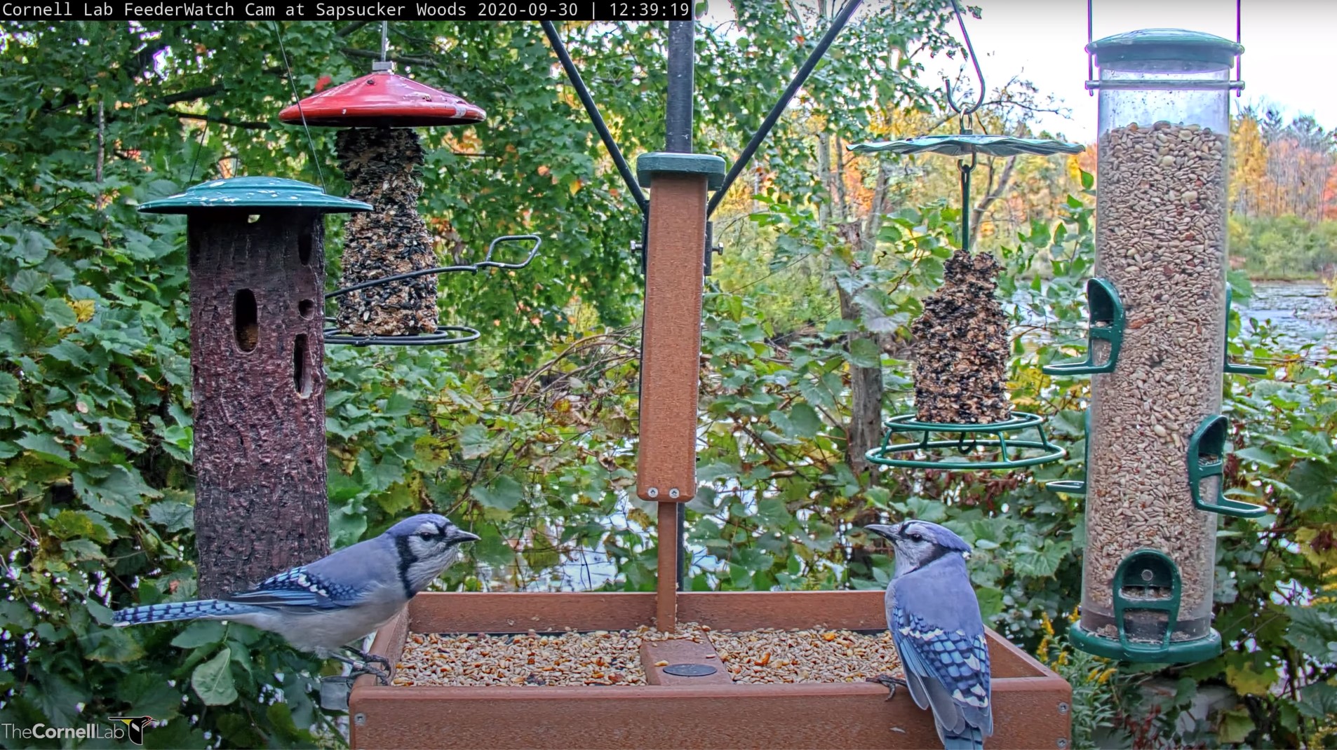
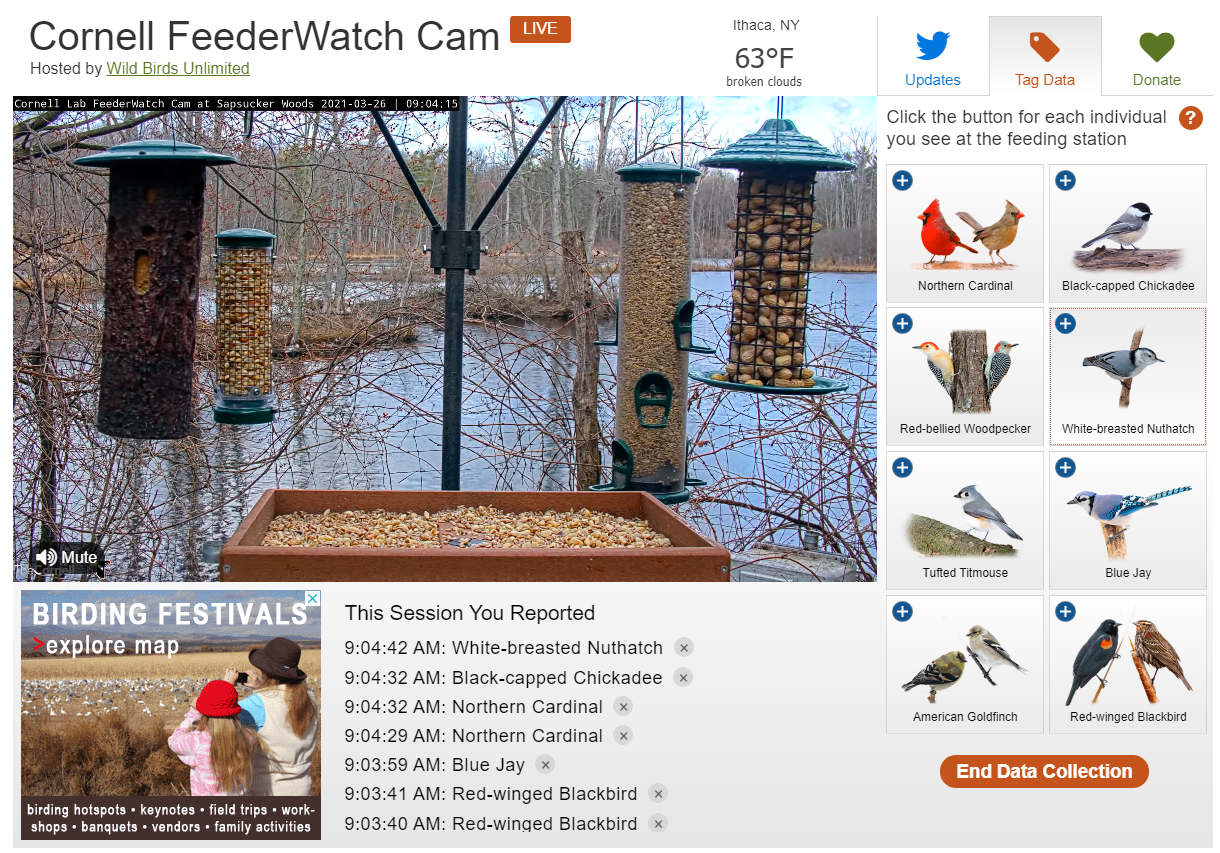
After the community took a vote, we decided to focus on eight species (Figure 1) and two weather variables, temperature and precipitation. We collected data in real time using a live data collection tool on the Cornell FeederWatch cam page (Figure 1). Over 490 people contributed to the effort by watching the cam and clicking buttons whenever they saw one of the eight species land on the feeding station. After collecting data for two weeks from March 31 to April 14, we amassed a total of over 120,000 observations.
The Bird Cams team then set to work addressing the challenges that come with collecting data live from the cam. Multiple people could watch the cam and collect data at the same time or different times from day to day. When people watched and collected data at the same time, their clicks may not have matched up because there is a delay between when something happens and when each of us clicks the button to report it. We also know from comments on the Discussion Board during data collection that there was also a delay when people waited to identify birds hidden on the backside of tube feeders until the birds flew away.
Additionally, as this was the first time integrating the live data tagging tool with the Cornell FeederWatch cam, we came across a small problem reported by a few participants: video feed did not load to be the current time, leading to incorrect observations. We have removed these spurious observations before creating data visualizations and preparing for analysis.
Challenge #1: When were people watching the cam?
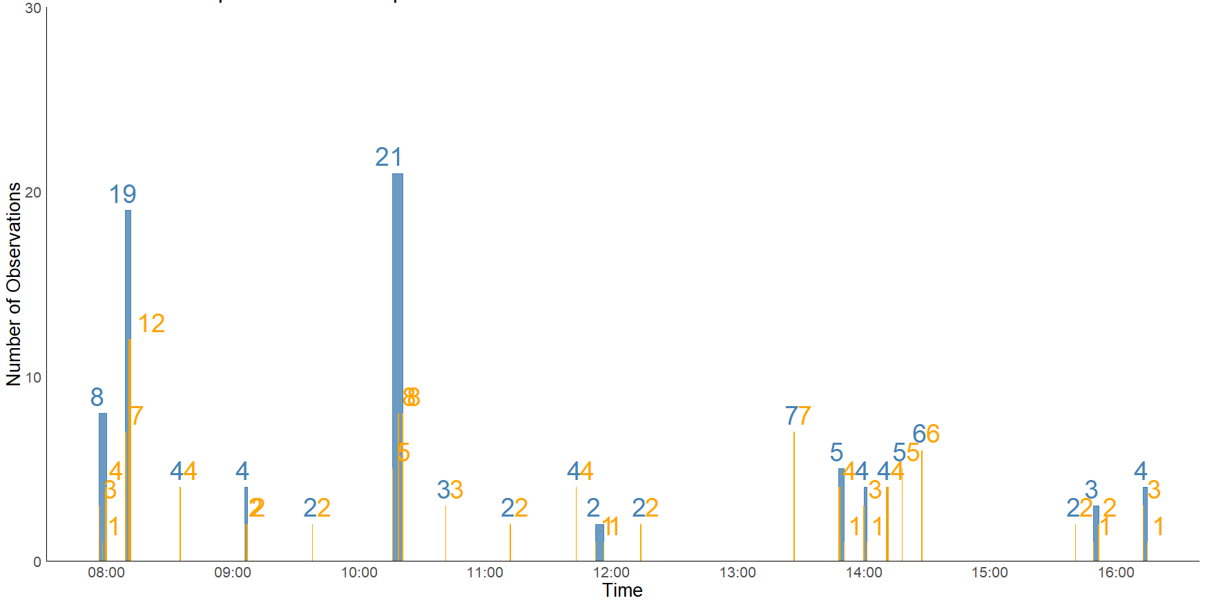
To be sure when the cam was and was not being watched, we limited the data set to only include participant sessions with a clear “start” and “stop” indicated by clicking the ‘End Data Collection” button, navigating away from the page, or timing out after 12 minutes due to inactivity. Then, to help us understand the sampling effort, or the amount of time that at least one participant was watching the cam and collecting data, we created a set of visualizations that shows the number of minutes watched each hour and number of hours watched each day as well as an interactive visualization that shows the number of data collectors each hour of the day for the first five days of data collection (Figure 2).
Figure 2. The number of people watching the Cornell FeederWatch cam and collecting data each hour from 5:00 AM to 8:00 PM for the first five days of data collection.
By looking at how much time was watched by date and by hour, we were able to see that for the majority of daylight hours (from sunrise to sunset), there was at least one person watching for each hour. A better understanding of sampling effort helps us understand whether changes in bird behavior, like visiting the feeding station, reported on one day compared to another are more likely because we watched the cam for longer or because there were actually more visits to the feeding station.
Challenge #2: How to interpret multiple observations for a single event?
For birds visiting a feeder, it can be hard to interpret the absolute number of visits when multiple people are watching and there is a delay in their clicks. We could “bin” observations so that observations within a certain amount of time of another would be considered one observation. For example, if one person marked that a Red-bellied Woodpecker arrived at the feeding station at 6:00:00 A.M. and another person marked that a Red-bellied Woodpecker arrived at the feeding station at 6:00:30 A.M., then are they same bird? Or two different birds? Same bird two different visits? To visualize what it looked like with actual data, we tried out two different “bin” times, one and five minutes, for Red-bellied Woodpecker observations on April 12 (Figure 3).
Similar to the Panama Live investigation, we determined that the best way to understand this data was to figure out the probability, or percentage chance, each species would arrive each half-hour. We chose a half-hour as opposed to each hour because the time interval needed to be short enough that most of it would have been watched by participants, but not too short that visualizing it would be impossible.
To calculate the percentage chance, we performed a series of steps. For each half-hour interval we determined how much of it was watched by one or more participants. If 15 minutes or more was watched, we considered that interval “watched.” Then, we assigned a “1” if the species was observed arriving at the feeder (present) and a “0” if it wasn’t (absent), creating a “presence-absence” dataset. This is the data set we will use when running analyses to determine the effects of weather.
Once we have the presence-absence dataset, to visualize the data we calculated the probability that a species would arrive during each half-hour time interval. For example, for 6:30 – 7:00 A.M., if the Red-bellied Woodpecker was there for four days and the total number of days participants watched that interval was eight days, then the probability would be 4/8 or 0.50. To turn that number into the percentage chance we multiply by 100 to get 50%.
Weather
In order to match the species visitation data to the temperature and precipitation data, we reached out to the closest weather station to the feeder station, located at the Ithaca Airport (approximately 1.6 miles away). The weather station records temperature (Fahrenheit) and precipitation (in inches) at the beginning of each hour. Check out another blog post to see what the weather data looked like during data collection.
We’ve purposely summarized the biological data (visitation and weather) and methodological data (time watched) in multiple different ways to give us the chance to understand the data and any underlying patterns. As with any scientific investigation, we need to visualize the data before we can perform any statistical analyses.
We invite and encourage everyone to explore the interactive visualizations. Please share your thoughts and questions in the forums below each visualization. Your observations and conversations are an important part of summarizing preliminary findings in the final report for Cornell Feeders Live.