What was the weather like during data collection for Cornell Feeders Live?
May 27, 2021When we came together to figure out what to study with the Cornell FeederWatch cam, many people in the community were interested in the effects of weather. Several people shared their observations at their own bird feeders and their predictions for how weather would affect birds’ behavior at the feeder.
“I would really like to see the correlation of weather and the activity at the feeders. I think about this question often as I observe my feeders and try to make some sense of the effect of weather on our bird buddies.” –Bonnie R
“I have been curious about this watching my own feeder though, already noticing there seems to be very distinct waves of certain species then long periods of nothing in between, sometimes appearing to correlate to “nicer” weather.” –Robin
“I often wonder if the birds can forecast bad weather. My feeders always seem a little busier just before a storm is predicted to roll in.” –Sharon Benson-Perry
“I think the weather question is quite interesting but would want to know the weather from the previous day as I suspect a previous day’s bad weather might increase visits.” –Robin Gibson
“Chickadees and blue jays might be particularly interesting since they are such different sizes — I wonder if small birds are more affected by weather changes than large birds.” –E.B. Fouts-Palmer
When the community upvoted the potential questions for investigation by feasibility and interest, the research question about weather rose to the top as one of our two research questions: How does weather affect the probability of different species visiting the feeders? The community also voted on which weather variables we’d look at first: temperature and precipitation (ex: amount of rain, snow, ice).
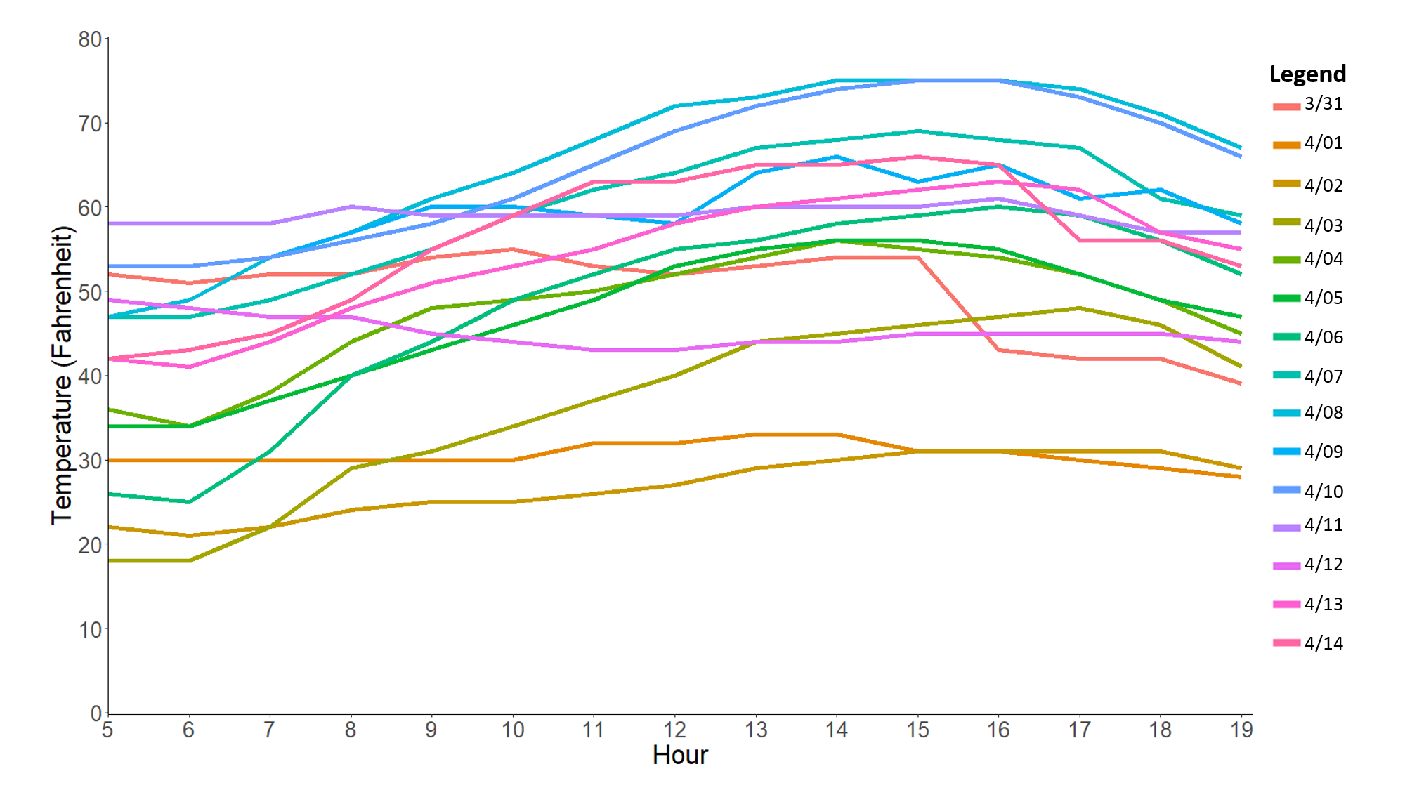
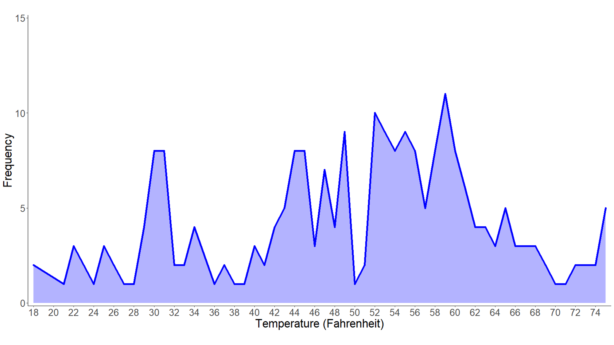
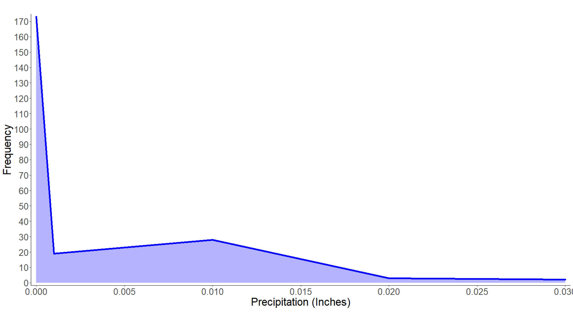
After data collection ended on April 14, the Bird Cams staff reached out to the closest weather station to the feeder station, located at the Ithaca Airport (approximately 1.6 miles away). The weather station records temperature (Fahrenheit) and precipitation (in inches) at the beginning of each hour.
Before we share visualizations that link the presence of each species at the feeding station to temperature and precipitation, we want to share visualizations of the weather data itself. Looking at how much the temperature and precipitation vary by hour, by day, and understanding the frequency of certain temperatures and precipitation will help us better understand what’s going on and inform our interpretations.
Temperature
Hourly Temperature
Daily Temperature

Temperature frequency
Precipitation
Daily Precipitation

Precipitation Frequency
What are your thoughts after looking at these visualizations? Do you have any ideas or questions about how we are looking at weather?
Please share your thoughts in the forum below.