Welcome to Panama Live Data Exploration!
Visualizations
Featured Post
September 22: Community inspires deeper dive into the data
Previous posts
August 20: Species differ in how they arrive at the feeder
August 10: How many focal species are arriving throughout the day?
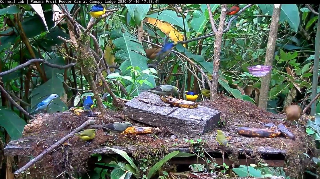
Join us to explore visualizations of the data collected by the Panama Live community in February 2020. More than 60 people made 11,000 observations while watching the Cornell Lab’s 24/7 Panama Fruit Feeder cam (opens link in new tab). We’ve put together a series of interactive graphs so that we can answer the questions we set out to investigate:
- When do focal species arrive at the feeder?
- How does this vary from day to day?
- Does the timing of food affect when birds arrive at the feeder?
Now it’s your turn to use these interactive graphs to explore the data. When looking at the graphs, keep our research questions in mind while also noticing if other questions pop up along the way? Share your observations, questions, and ideas in the comment forums below each graph. At the end of this exploration we’ll draw from your comments in the forums, as well as in an upcoming live Q&A session, to surface the most interesting and important findings. Then, we will publish what we find in a public post!
To get started, check out the newest blog post for a guided discussion about a featured graph. You can also jump right into the data yourself by using the links under “Visualizations.”
Want to know how we turned all of the community observations into these visual explorations?
Check out this blog post to learn more!
Want to know more about the Panama Fruit Feeder featured in the project?