Situations Over Time
January 27, 2020This week’s featured visualization displays how frequently the two most common situations at the nest occur across time—adults brooding nestlings and adults feeding nestlings.
Click here to see the interactive version of this graph.
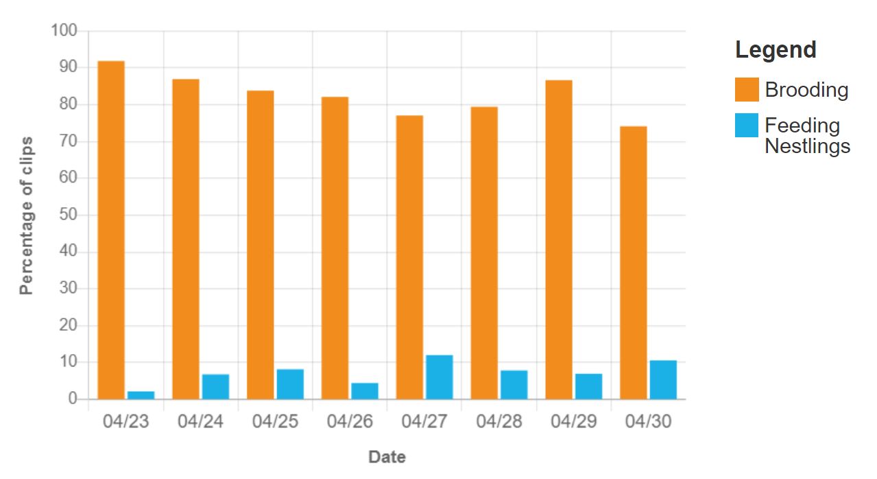
In the chart above, the orange bars represent the percentage of clips each day that include brooding (i.e. when an adult sits on the nestlings to keep them warm) and the blue bars represent the percentage of clips that include adults feeding the nestlings. Each pair of bars represents one day, and the date advances from left to right from 04/23 to 04/30.
Looking at the heights of the orange and blue bars, the amount of time spent brooding decreases over the days and the amount of time feeding nestlings might be increasing but fluctuates quite a bit. Because the magnitude (or amount) of change across days is very small we can’t be completely confident it reflects any significant change in feeding behavior. The slight increase may also appear because 04/23, when the amount of time feeding the nestlings is low, is also when the nestlings are still hatching. The brooding pattern does coincide with what we have seen at the nest: as nestlings get older and are able to thermoregulate themselves better, the adults reduce their time brooding.
What are your thoughts about what these data can tell us? Should we look at or consider something else?
Share your thoughts below and then play with an interactive version of this chart here.