Community Inspires More Visualizations
October 3, 2019Thank you to everyone who has joined us in this phase of data exploration! Your ideas and questions have inspired us to dig deeper into the data by creating a new set of visuals.
Before we dive into the interactive visuals, we want to feature an interesting visual that looks at the interaction between the number of birds (abundance) and number of species (biodiversity) as it relates to displacements. Our current visualization tool is still under development and not yet able to produce a graph with multiple lines. So we will instead look at it here in its static form.
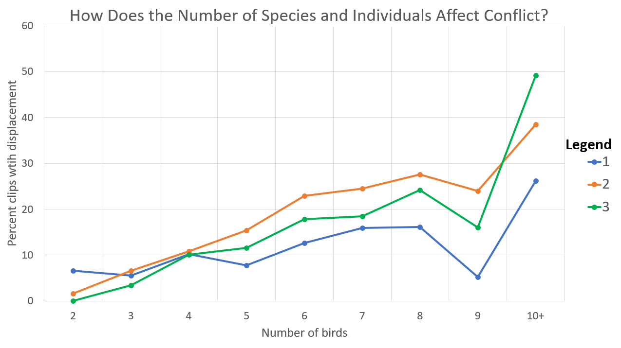
The horizontal axis shows the number of birds from 2 to 10 or more and the vertical axis shows the percentage of clips with at least one displacement. Each color corresponds to a different number of species. For example, the blue points connected by the blue line shows the results for clips with one species while the green points connected by the green line shows the clips with three species.
Does anything stand out to you? This graph mirrors what we explored a couple weeks ago when we considered how the number of species and the number of individuals each separately relates to displacements. A pattern that you might notice in the visual above is that no matter how many species there are, the percentage of clips with a displacement increases with the number of individuals. The number of species doesn’t seem to influence that increase very much.
Please share your thoughts below and then explore other interactive charts inspired by your ideas and questions here.