Does Conflict Increase With More Species on the Feeder?
August 26, 2019Welcome to the first week of Battling Birds Data Exploration!
Let’s dig into the data you collected to see what we can find out!
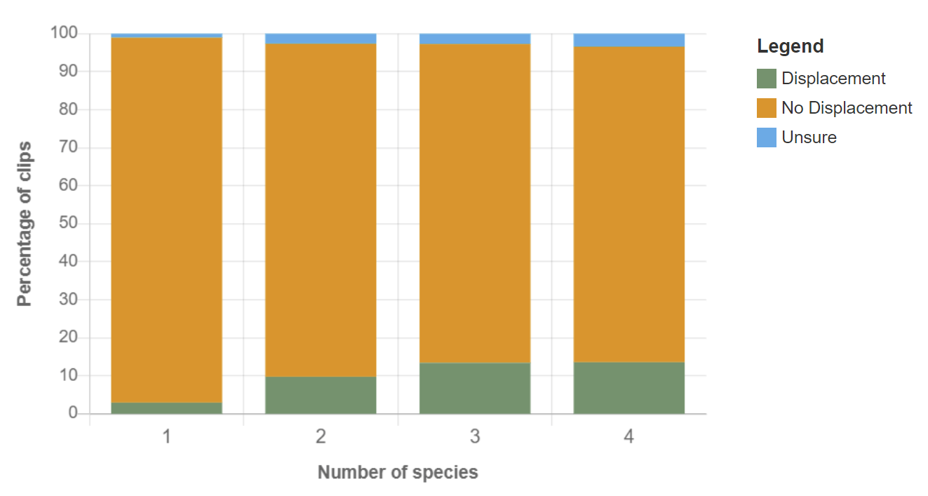
Today we’re featuring a visualization that looks at the relationship between conflict and the number of species present at the feeders. We are measuring conflict by looking at the percentage of clips with at least one displacement—when one bird attempts to take over the food or perch of another bird.
Click here to see the interactive version of this graph.
This chart helps us explore one part of our main research question: What is the relationship, if any, between the number of species at the feeder and the number of displacements? Each color describes the type of interaction categorized by participants.
- Green = percentage of clips with at least one displacement
- Orange = percentage of clips with no displacements
- Blue = percentage of clips where there was no agreement on whether there was a displacement
Note that as the number of species at the feeder increases from left to right, the height of each color bar changes. The height of the green bars increases while the height of the orange bars decreases as the number of species increases. This signals that as the number of species increased, it seems that a displacement is more likely to occur.
To see if this pattern holds true for the second part of our research question, how does the number of individuals relate to displacements, click here. You’ll see an interactive graph that allows you to click on different categories of information to see if the number of individuals is also associated with more displacements.
We can also start to think about why we might see this pattern–a higher chance of displacements with more species at the feeder. Do you have any ideas or hypotheses as to why the chance of displacements occurring might increase as the number of species increases?
Share your thoughts below and then play with an interactive version of this chart here.